Skip to content


While national and international standards exist for driver’s license and ID formatting, oftentimes the design choices are left up to the state. This usually doesn’t present many issues and allows states to express their artistic sentiments, but sometimes, it can lead to unforeseen complications. Here, we explore some of the worst ID designs we’ve seen over the years and discuss why they are problematic for businesses.
1. Colorado ID design 2016 and 2020
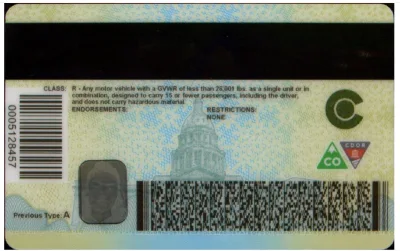
Problem: Color image behind the barcode
This ID lives in design infamy because of the inability to scan the barcode. Colorado added a color image behind the PDF417 barcode on the back of the ID as a design element and added security feature, but this prevented the ID from scanning properly. By placing additional imagery behind a scannable barcode, it prevents an ID scanner from effectively reading the barcode which can not only prevent legitimate IDs from passing inspection, but it can also allow fake IDs to pass. Without a reliable ID scanning format, it put businesses at a higher risk for fraud and non-compliance. Luckily, the ID format has since been updated, but this ID still holds a place in our worst IDs of all time.
2. California redwood ID design 2025
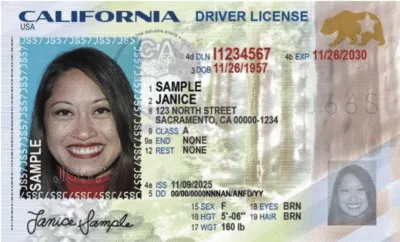
Problem: Redwood imagery in the middle of the ID and poppy plant
The California ID, redesigned in 2025 and generally well designed, included imagery of redwoods in the middle of the ID front as well as a poppy plant that partially obscures driver’s license class. At first glance, it might not seem problematic, but for ID scanners, it made some of the characters unreadable. This becomes a larger issue when businesses are doing cross-matching via OCR, or need image capture to prevent chargebacks. Without cross-match capabilities, businesses are not able to properly authenticate an ID. While the images can technically still be captured by an ID scan, if the characters are unreadable, businesses are unable to properly fight chargebacks or relay ID images to investigators.
3. Quebec health insurance ID card 2018

Problem: Text embossed without ink
Back in 2018, Quebec redesigned their health insurance ID cards. The back of the ID card is fairly standard and unproblematic, featuring both a PDF417 and a 1D barcode which are easily scanned and verified. The front of the ID featured ink that changed based on the angle of the ID and light, and it also featured tactile engravings. However, the tactile engravings were not independently colored, leading to difficulty reading the information both to the naked eye and to ID verification technology. The lack of definition on the tactile engravings made both OCR and cross-match difficult when ID scanning, and was difficult to read in lower lighting conditions. This was especially impactful for hospitals, pharmacies, and other healthcare providers who must scan health insurance cards to ensure proof of coverage, and opened the door to fraudulent IDs being accepted.
4. Australian IDs in Tasmania and Victoria 2021-2022
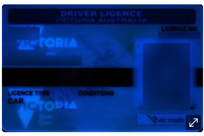
Problem: Black text on the windowpane feature
Australian IDs in both Tasmania and Victoria, designed in 2021 and 2022, respectively, both have a windowpane feature running horizontally across the IDs. The license expiration date and date of birth are both printed in black text across the windowpane feature. While this might seem like an aesthetically pleasing security feature, it actually makes it more difficult for ID scanners to accurately capture data. When scanning an ID, even using UV, IR, or white light for ID authentication, the text becomes black-on-black, making it extremely difficult to read. This results in inaccurate ID authentication results for high-risk or heavily regulated businesses.
5. New Jersey ID design 2020
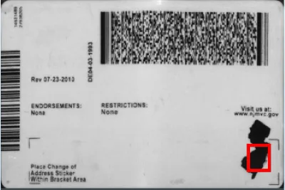
Problem: Design element mistaken for void mark
In 2020, New Jersey released a new driver’s license and ID format that featured an outline of the state on the back right corner of the ID. While the feature seems like a nice homage to the state, it initially caused problems for ID authentication engines when ID scanning. Due to the location of the design feature, authentication engines initially mistook the design element for a void mark since it was in the same location that void marks are typically placed on IDs. This initially led to a lot of legitimate IDs failing when being scanned.
6. Florida ID design 2017
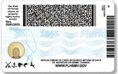
Problem: PDF417 barcode clarity
The Florida ID was redesigned in 2017, and while it might not have exclusively been a design issue, there were printing issues with the Florida Department of Transportation. The PDF417 barcode on the back of many of these new IDs was blurry, preventing it from being scanned. It is unclear whether this was primarily a design issue or a printer quality issue at DMVs across the state, but luckily for Florida and US businesses alike, the barcode clarity issue seems to have been resolved.
7. French ID material and size 2016
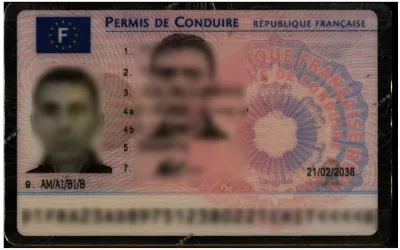
Problem: Uncommon size and poor material quality
The odd sizing is only the start of the issues for the French ID. The quality is the larger issue, especially when passing it through an ID scanner. It quite literally looks like sheets of paper that were stuck together and run through a laminator. The odd dimensions of the ID also limit which ID scanners it is compatible with, as it will not fit into all authentication-capable scanners. This prevents businesses, especially those with high volumes of French customers, from effectively verifying IDs to prevent fraud.
Final thoughts
At first glance, poor ID design may seem like a minor inconvenience, but as these examples show, even small design decisions can have large impacts on fraud prevention, compliance, and operational efficiency. When barcodes don’t scan, text can’t be read, or layouts interfere with ID authentication, businesses are left vulnerable to accepting fraudulent IDs or incorrectly rejecting legitimate customers.
This is exactly where IDScan.net’s technology differentiates itself. Rather than relying on rigid, one-size-fits-all verification, IDScan.net is built to adapt to the real-world inconsistencies of identity documents across jurisdictions. From rapidly updating parsing libraries to account for new ID formats, to leveraging advanced OCR, image processing, and authentication logic that can work around imperfect designs, the platform is engineered for resilience.
As ID formats continue to evolve, sometimes for the better, and sometimes not, businesses need a solution that evolves with them. IDScan.net’s commitment to continuous updates, global ID coverage, and intelligent scanning ensures that even the “worst” ID designs don’t become your biggest liability.